Contents
Page designer: Best practice (long blog style - not split)

We're regularly updating Page designer to bring improvements to Advanced HR and how your users interact with it. With all the tools that are now available to empower you to create and customise your pages, we felt it best to give some guidance on where best to use them and what to consider when designing your pages.
Why page structure is important
Advanced HR is a powerful tool that can help you manage all aspects of your HR department, from employee data to payroll. But with so much data to manage, it can be difficult to know how to best display it in a way that is clear, concise, and easy to understand for all users; including those with disabilities and those who use assistive technologies. Additionally, a well-structured page can help to reduce the cognitive load on all users.
In this blog post, we will discuss the best practices for using Page Designer to create well-structured pages in Advanced HR. By following these tips, you can improve the user experience for your users, making it easier for everyone to find the information they need quickly and easily.
Information foraging
Have you ever scanned a page of data to find a specific piece of information? Maybe you were looking for a national insurance number, or an employee's start date. If so, you were engaging in information foraging.
Information foraging is a term used to describe how people search for and consume information. It's a concept that can be applied to any type of information, but it's especially relevant when designing pages that display data.
Page designers can use visual cues to highlight important information and organize data in a clear visual hierarchy, using tabs, headings, sections, groups, and dividers. This will help users quickly develop a scent for where their information is located and forage for it efficiently.
Accessibility & Usability
Firstly, lets quickly layout our ethos around page structure.
Accessibility in applications is about making them accessible to everyone, including people with disabilities. This means following certain design guidelines and standards to make sure that people can use the application with assistive technology, such as screen readers, speech recognition software, and screen magnifiers.
Usability in applications is about making them easy and enjoyable to use for everyone. This means designing the application in a way that is clear, consistent, and efficient. It also means making sure that the application is visually appealing and that the user experience is positive.
Here is a simple analogy to help you understand the difference between accessibility and usability:
Imagine a building with a wheelchair ramp. The wheelchair ramp makes the building accessible to people with disabilities, but it doesn't necessarily make the building usable. For example, the building could still be difficult to navigate, or the doors could be too heavy to open.
In the same way, making a application accessible doesn't necessarily make it usable. For example, the application could still be difficult to understand or navigate, or the buttons could be too small to click.
Accessibility and usability are essential for applications like Advanced HR, where employees with different roles and equipment need to be able to view and understand data. We are committed to making Advanced HR as accessible and usable as possible, and we strive to meet WWC 2.1 accessibility standards and our own internal usability guidelines.
By making your pages accessible, you can be assured that all your employees have equal access to the data they need to do their jobs. This can lead to increased productivity and employee satisfaction 👍.
Vertical ↕ vs Horizontal ↔
Vertical columns of fields on a page are more accessible than horizontal rows. This is true for all users, not just people with disabilities. This is because vertical columns are easier to scan with one eye. Whilst this is true for all users, it's significantly easier to read for people with impairments.
For example, a person with a visual impairment can use a screen reader to access the data in a vertical column, one line at a time. This is much easier than trying to scan a horizontal row of data, where the words may run together.
Similarly, a person with dyslexia may find it easier to read data in a vertical column, where the words are separated and easier to focus on.
Finally, a person with a mobility impairment may find it easier to navigate a webpage with vertical columns, using a keyboard. This is because they can move up and down the page, one column at a time, without having to move the cursor to the left or right.
If you are designing a webpage that displays data to employees with different roles and equipment, it is important to consider the accessibility of the data. Displaying data in vertical columns ↕ is one way to make your pages in Advanced HR more accessible to everyone.
Sections ↕
Sections bridge the gap between vertical layouts and maximising the available space on the page. They split the page into cards that can be read individually in a vertical layout. The cards are then automatically arranged horizontally in rows to make the best use of any remaining space on the page.
We believe this gives the best balance between having an accessible page for infrequent users and making it easy for frequent users to quickly access data.
When setting up sections we'd suggest the following:
- Keep sections succinct
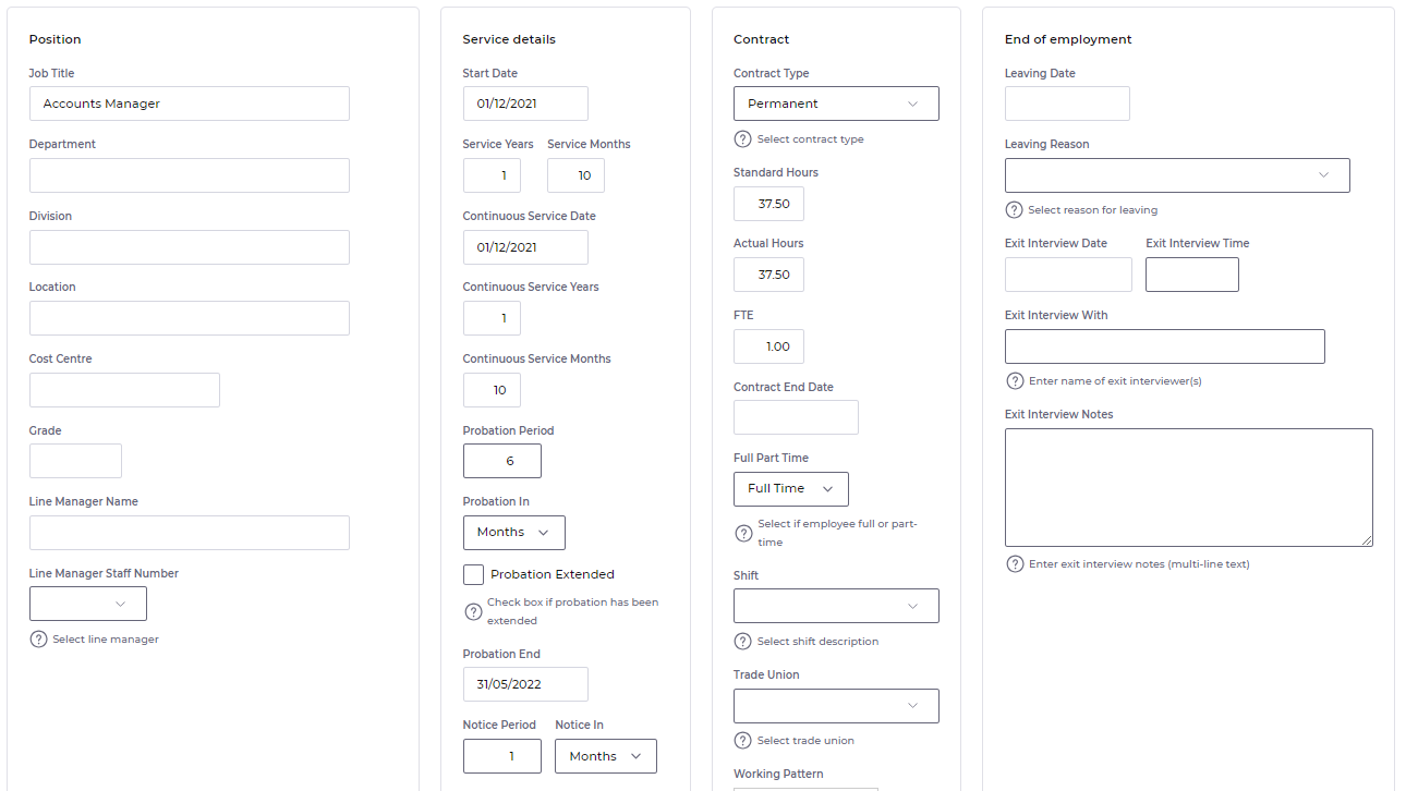
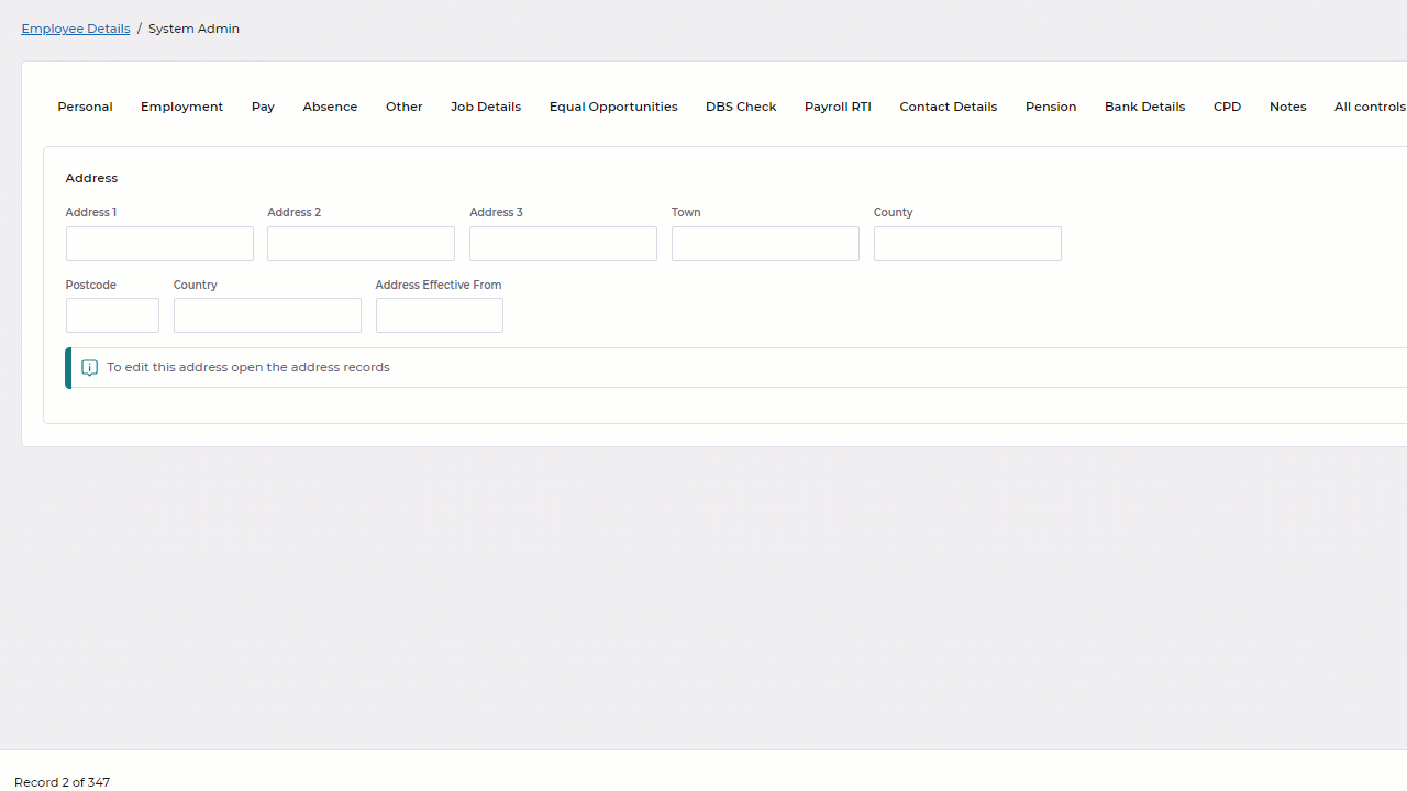
👪 Sections work best when they contain a family of related fields, such as a section to pull together all the fields related to someone's address. This image shows a good use of sections to pull together related families of fields.
- Keep sections roughly equal sizes
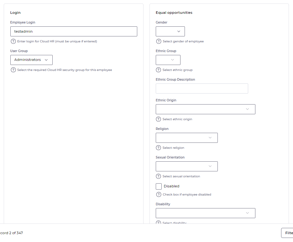
📏 Sections on the same tab work best together when they have roughly the same number of elements. Because sections are arranged in rows, having one section significantly larger than another can introduce space back onto the page. Below is an example of how this can happen with unevenly populated sections.
- Let sections do the horizontal arranging
⛔ Sections work best when they do not contain large horizontal groups. They were designed to answer the question of how to fill up empty space horizontally along the page. If a group is trying to achieve the same goal, then the two features effectively work against each other. In these cases you may find this causes the elements in a group to wrap onto a new row inside the section (as seen in the Wrapping animation).
In certain situations the best use of sections may actually be to not use groups at all...
Groups ↔
Groups are designed for horizontally grouping small amounts of data that belong to the same logical entity, such as a start date and start time for an absence or a person's date of birth and age. They were designed to be used inside a vertical layout.
Groups are used best when:
- 🤏 They have fewer fields in them. As it's easier to read the page vertically.
- 💾 The fields are different types of data, such as a date value for date of birth and a numeric value for age. As this makes it easier for people to read along a group horizontally.
- 📎 They logically belong to the same entity. Research has shown that having 2 or 3 fields in a horizontal group didn’t cause issues if they logically belonged to the same single entity, such as a person's date of birth and their age. There's some ambiguity over what classifies fields as belonging to the same entity. Ultimately it's up to you to decide what's logical based on the context of the situation and the cognitive load it requires of your users.
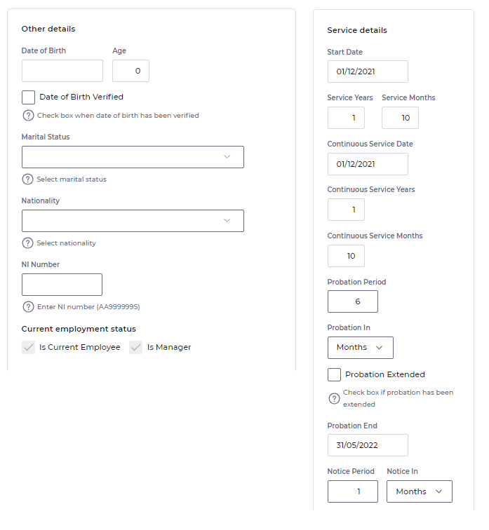
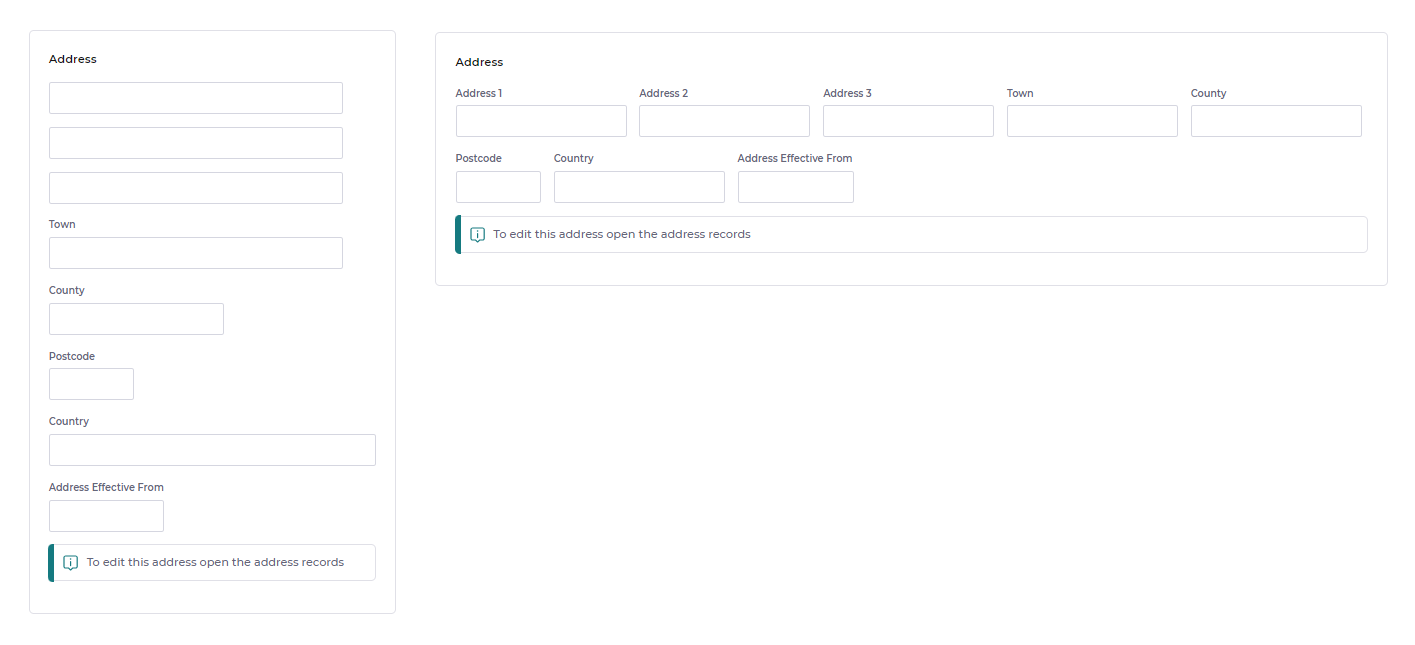
This image illustrates how we think groups should be used. Small horizontal groups of tightly related fields, arranged in a vertical layout or more loosely related fields inside a section.
Wrapping 🔄
So why don't we like big horizontal groups? The increased cognitive load on users trying to information forage when fields wrap.
Here's an animation to show how big horizontal groups wrap for different screen resolutions. We'd consider this to be poorly designed based on our accessibility principles because in order to read the data in a coherent way at anything other than the thinnest resolution your eyes need to follow a Z path.
And here's an animation to show how sections get automatically reordered for different screen resolutions. This time the vertical order of each section is maintained, which means a users eyes can find a topic first then follow a straight path down. This makes it easier for users to forage for data on the page regardless of the resolution.
Design for intuition 💡
Did you notice in the wrapping animations that the address section is much easier to read in the second animation, even though it displays all the fields in exactly the same order?
That's because people expect particular data to be displayed in a certain format. Those formats are often internationally recognised and something most people are so familiar with, that they can intuitively use that format with no extra training. An address block is a good example of this.
All to often as administrators, we can get so caught up in the technical aspects of the tools that we're using and the features we're trying build; that we lose track of who we're building things for.
The benefits of whitespace ⬜
We've done a lot of research and work into helping you effectively use the space on the page. But it would be remiss of us to not mention the positive uses of empty space on a page, aka whitespace. It is often overlooked, but whitespace is an essential part of good application design. It has many benefits for a users experience with a product, including:
- 👓Improved readability and comprehension: Whitespace makes text easier to read by giving the eyes a break. It also helps to separate different sections of content, making it easier for users to scan and understand.
- 🧠Increased focus and attention: Whitespace can be used to draw the user's attention to specific elements on the screen. For example, you can use whitespace to surround a call-to-action button, making it more visible and enticing.
- 📊 Enhanced visual hierarchy: Whitespace can be used to create a visual hierarchy, which helps users to understand the importance of different elements on the screen. For example, you can use more whitespace around important elements, such as headings and headlines, to make them stand out.
- 🧹 Reduced clutter and fatigue: Whitespace helps to reduce clutter and fatigue on the screen. When there is too much information or too many elements competing for the user's attention, it can be overwhelming and confusing. Whitespace helps to create a sense of calm and simplicity, making it more enjoyable and efficient for users to interact with the application.
Imagine that you are walking into a crowded room. It is difficult to focus on anything because there is so much going on around you. Now imagine that the room is empty, except for a single chair in the center. The chair immediately stands out, and it is much easier to focus on it.
Whitespace works in a similar way in application design. When there is too much clutter on the screen, it is difficult for users to focus on the important things. However, when whitespace is used effectively, it helps to draw attention to the most important elements and makes it easier for users to understand and interact with the application.
Our new layout allows us to bake a level of whitespace into Advanced HR in the form of things like the spacing between headings and paragraph text. Giving you tools like groups and sections gives you more flexibility on how you use the whitespace.
Just remember not all whitespace is bad. Sometimes less is more. (He says 2000 words into a blog post 😀)
Thinking of the fold 📰
The term the fold in application design refers to the part of a website or app that is visible on the screen without scrolling. In the early days of the web, when most users were viewing websites on desktop computers with relatively small screens, the fold was a very important concept. Designers would carefully place the most important content above the fold so that users would see it immediately.
However, as devices have evolved and screens have become larger, the concept of the fold has become less important. Today, users are more likely to scroll on their smartphones and tablets, so designers can afford to place important content below the fold.
That said, the fold is still a useful concept for designers to keep in mind. By placing the most important content above the fold, designers can give users a good first impression and encourage them to explore the rest of the page.
Here are some tips for designing above the fold:
- 🔝 Place your most important content above the fold.
- 👓 Keep your design simple and easy to read.
- ⬜ Use whitespace to create a sense of calm and simplicity.
- 💻Test your design on different devices and screen sizes to make sure that the most important content is always visible above the fold.
Rule of 👍
At the end of the day these are just guidelines. We'll bake good great accessibility into the product wherever we can, everything else is a suggested rule of thumb. There are plenty of legitimate situations where you may not feel it is best to follow the advice above. And that's fine. Go with it. We believe they're important and we hope you buy into them. But they may not work for you all the time.
With page designer you are in control of how your data is laid out.
Happy designing 😎