Contents
- 24.8 Release notes
- New Section addition in Page designer
- Improved layout on Custom reports
- Improved layout on Calendar reports
- Improved layout on Cross tab reports
- Improved layout on Record Profile reports
- Improved layout on Organisation reports
- Improvement to the layout of Absence breakdown, Bradford factor, Stability Index and Turnover reports
- Removal of Workflow confirmation messages
- Small improvements to Cloud folders within Admin
- Small improvements to Files
- Changes to the name of Utilities
Advanced HR 24.8 - 2nd November 2023
Updated
by Kellie Oxley
- 24.8 Release notes
- New Section addition in Page designer
- Improved layout on Custom reports
- Improved layout on Calendar reports
- Improved layout on Cross tab reports
- Improved layout on Record Profile reports
- Improved layout on Organisation reports
- Improvement to the layout of Absence breakdown, Bradford factor, Stability Index and Turnover reports
- Removal of Workflow confirmation messages
- Small improvements to Cloud folders within Admin
- Small improvements to Files
- Changes to the name of Utilities
24.8 Release notes
This page contains details of new and amended functionality included in the software update deployed on Thursday 2nd November 2023.
New Section addition in Page designer
What have we done?
We have introduced a new element to Page designer called Section.
Why have we done this?
To allow you to group fields together into Sections within Records.
How will you benefit?
The implementation of sections will allow you to group fields together into specific sections on screen, making better use of the space on screen and allow you to present the data as required.
Details of the change
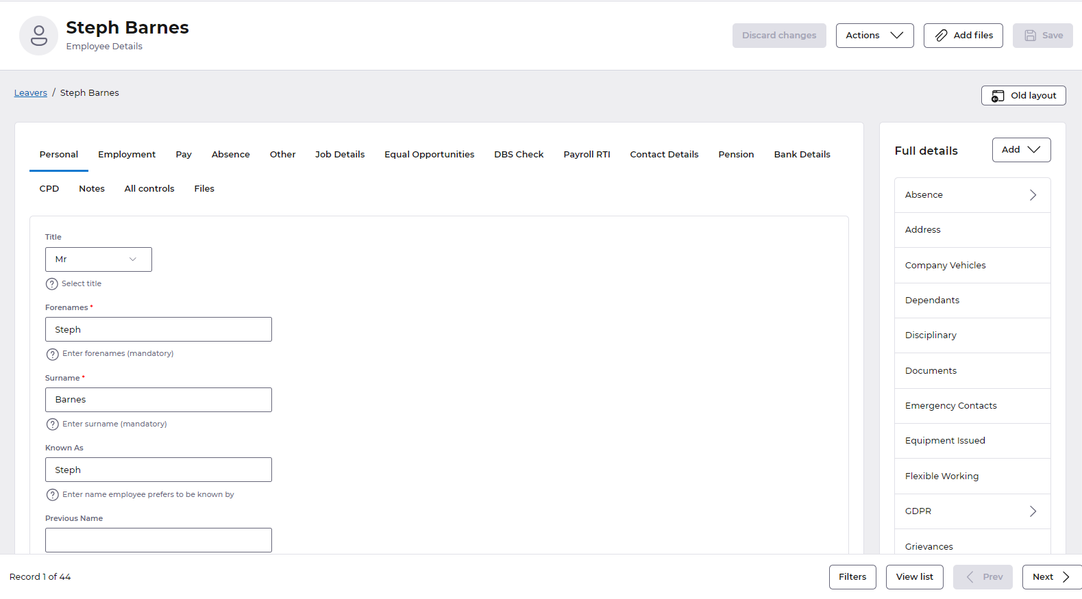
We will automatically place all of your fields and groups into one section on screen as part of this release - placing all of the fields and groups in each tab into a card, which we refer to as a Section:
You are then able to add further sections and move fields and groups around where needed, via Page designer. Section is now an option to choose from when selecting the Add element button:
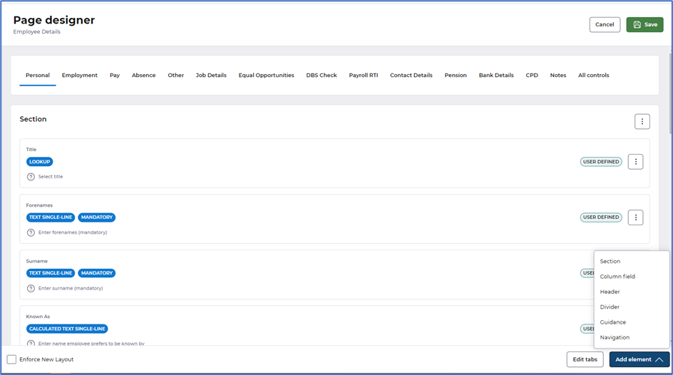
Selecting Section creates a new Section as follows with a heading added as default - the heading can be removed if not needed once fields are moved into the new section:

You can read more about using Sections in our Custom elements article. For guidance on best practice when implementing anything Page designer related, check out our new collection of help documentation.
Improved layout on Custom reports
What have we done?
We have made some improvements to the way in which data is presented when configuring Custom reports.
Why have we done this?
To present the data better so it is inline with other areas of HR.
How will you benefit?
The data within each tab on custom reports is presented in a much easier to read format, with fields now displayed in the appropriate tabs.
Details of the change
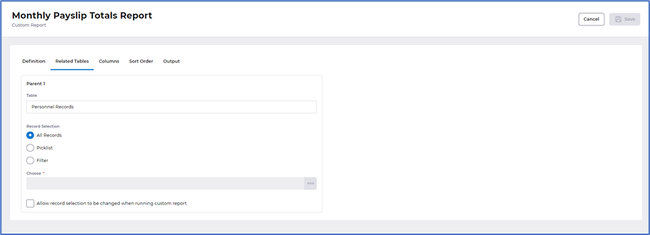
The data in Related tables where its configured against a parent table is now in a section on screen, with the introduction of the tick box to Allow record selection to be changed when running custom report:
We have made some small improvements to the layout of the Sort order tab. Introduced tick boxes rather than toggles and actions menu, Add and Remove buttons moved to the top of the screen in line with the rest of HR:

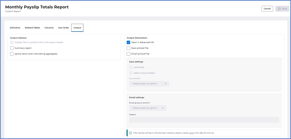
Output tab is now displayed in sections - Output options and Output destination, Output destination is now consistent with the rest of HR:
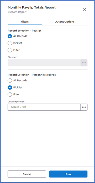
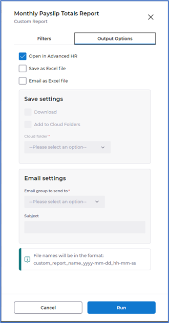
Selecting to Run a Custom report from the actions menu will now present as a draw from the right of your screen. This is displayed in two tabs, Filters allowing you to amend the record selection filters - providing the tick box is selected in the definition and/or related tables and Output options to change the output destination:
Improved layout on Calendar reports
What have we done?
We have made some improvements to the way in which data is presented when configuring Calendar reports.
Why have we done this?
To present the data better so it is inline with other areas of HR.
How will you benefit?
The data within each tab on calendar reports is presented in a much easier to read format, with fields now displayed in the appropriate tabs.
Details of the change
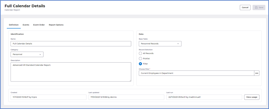
The Definition tab is now displayed in sections - Identification, Data and Usage. Previously the definition contained Report options, we have moved these to the Report Options tab, so the definition remains consistent with the rest of HR:
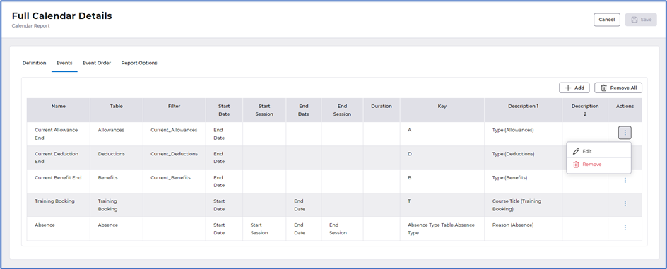
Events tab was previously Event Details. The data in this tab remains as was, with a slight improvement on the Add/Remove buttons displayed at the top as well as an Actions column which allows you to Edit or Remove, this is to align the design of this screen with the rest of HR:
Event order tab was previously Sort order. The data in this tab remains as was, with a slight improvement on the Add/Remove buttons displayed at the top as well as an Actions column which allows you to Move up or Move down and Remove, this is to align the design of this screen with the rest of HR:

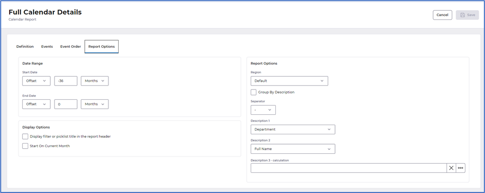
Report options tab was previously Report details. These options are now displayed in three sections on screen Date range, Display options and Report options, incorporating the data displayed previously in this tab with data previously displayed in the definition tab:
Improved layout on Cross tab reports
What have we done?
We have made some improvements to the way in which data is presented when configuring Cross tab reports.
Why have we done this?
To present the data better so it is inline with other areas of HR.
How will you benefit?
The data within each tab on cross tab reports is presented in a much easier to read format, with fields now displayed in the appropriate tabs.
Details of the change
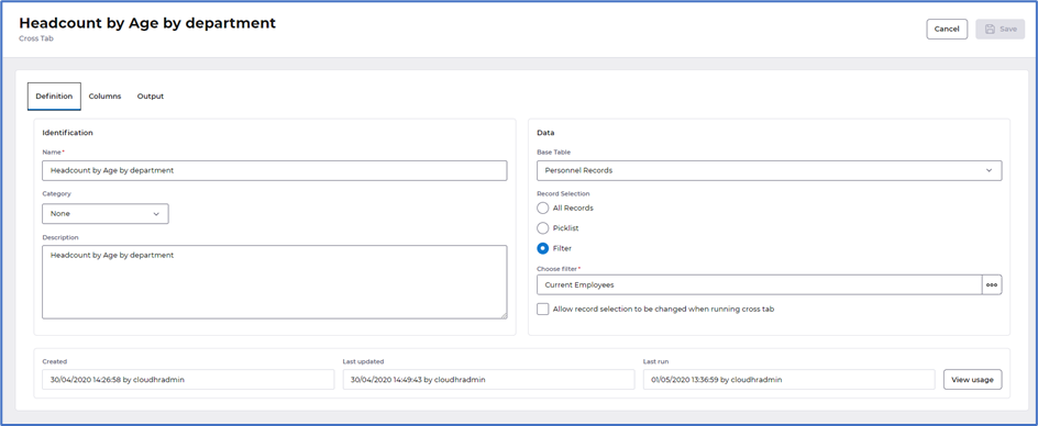
The Definition tab is now displayed in sections - Identification, Data and Usage, with the introduction of the tick box to Allow record selection to be changed when running report:
Columns tab is now displayed in sections - Headings & Column Breaks and Intersection, some of the options previously displayed in the Columns tab have been moved to the Output tab:

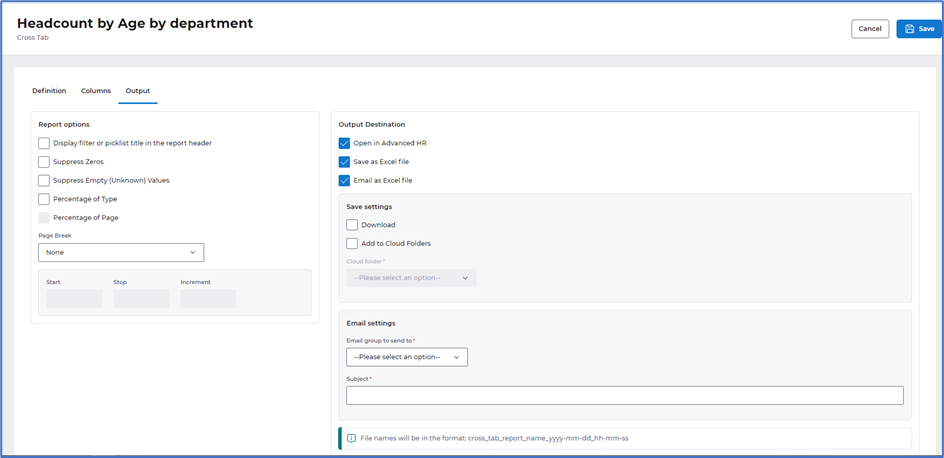
Output tab is now displayed in sections - Report options and Output destination, Output destination is now consistent with the rest of HR:
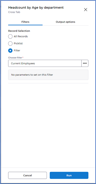
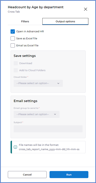
Selecting to Run a Cross tab report from the actions menu will now present as a draw from the right of your screen. This is displayed in two tabs, Filters allowing you to amend the record selection filters - providing the tick box is selected in the definition as mentioned above and Output options to change the output destination:
Improved layout on Record Profile reports
What have we done?
We have made some improvements to the way in which data is presented when configuring the definition and output of Record profile reports.
Why have we done this?
To present the data better so it is inline with other areas of HR.
How will you benefit?
The data within the definition and output tabs is presented in a much easier to read format, with fields now displayed in the appropriate tabs.
Details of the change
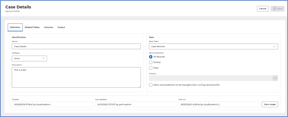
The Definition tab is now displayed in sections - Identification, Data and Usage, with the introduction of the tick box to Allow record selection to be changed when running record profile. Previously the definition contained Report options, we have moved these to the Output tab, so the definition remains consistent with the rest of HR:
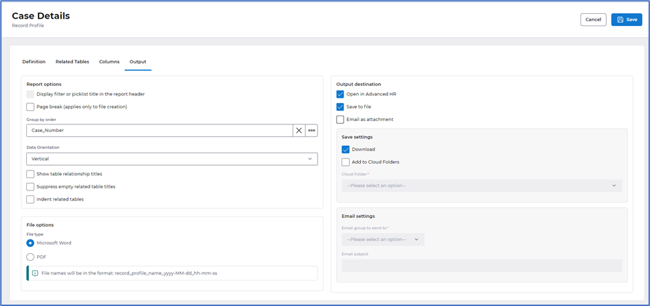
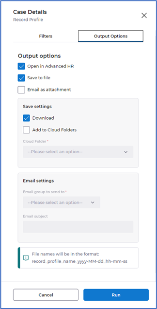
Output tab is now displayed in sections - Report options, File options and Output destination. Output destination is now consistent with the rest of HR:
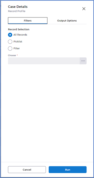
Selecting to Run a Record profile report from the actions menu will now present as a draw from the right of your screen. This is displayed in two tabs, Filters allowing you to amend the record selection filters - providing the tick box is selected in the definition as mentioned above and Output options to change the output destination:
Improved layout on Organisation reports
What have we done?
We have made some small improvements to the way in Organisation reports appears in the left hand many and how data is presented on Organisation reports.
Why have we done this?
To present the data better so it is inline with other areas of HR.
How will you benefit?
The data is now displayed in line with the rest of HR.
Details of the change
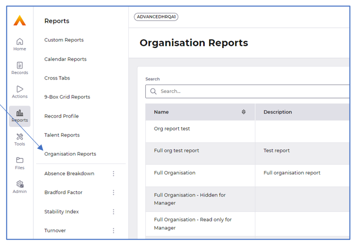
Organisation reports are now displayed above the line in the left hand menu:
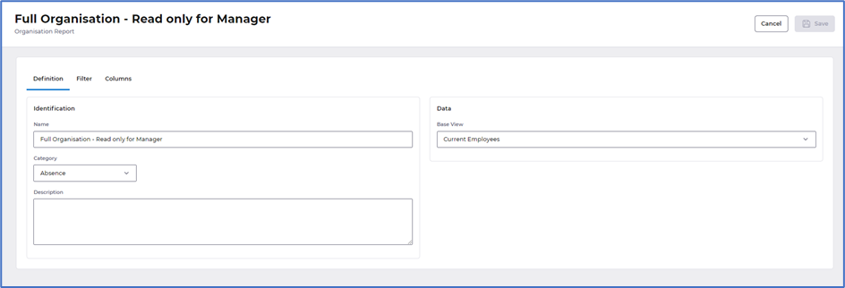
The Definition tab is now displayed in sections - Identification, Data:
The Filter tab has had a slight change in layout with the buttons now displayed at the top:

Improvement to the layout of Absence breakdown, Bradford factor, Stability Index and Turnover reports
What have we done?
We have made some small improvements to the way in which you run and edit defaults on Absence breakdown, Bradford factor, Stability Index and Turnover reports.
Why have we done this?
To present the data better so it is inline with other areas of HR.
How will you benefit?
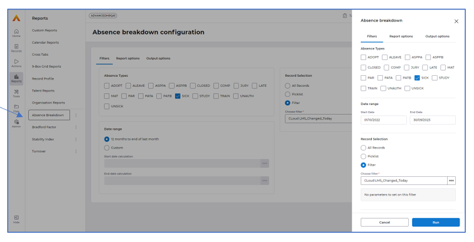
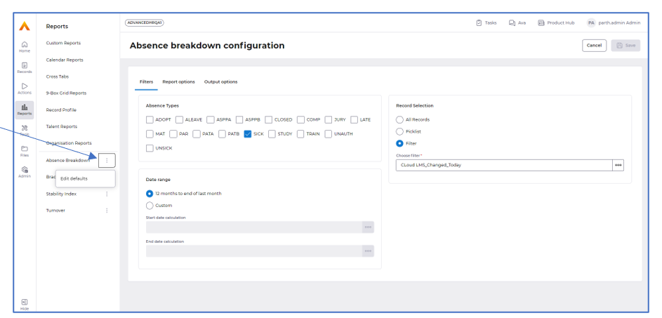
You can now edit the defaults for these reports within the Reports module and the display of them is now in line with the rest of HR.
Details of the change
Selecting any of the reports from the left hand menu opens a draw on the right hand side of the window. This allows you to amend any of the Filters, Report options and Output options before choosing to select Run, as shown in the example below for Absence breakdown:
The three dots displayed by each report allows you to edit the defaults directly within Reports previously accessed via the Admin menu:
Removal of Workflow confirmation messages
What have we done?
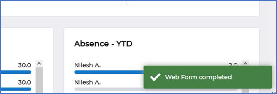
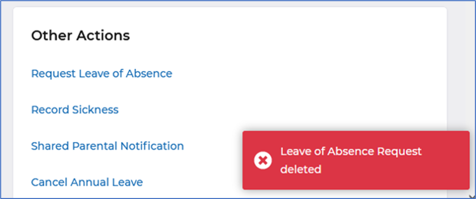
We have removed all notifications that appear when performing an action on a workflow. Notifications will continue to appear when we need to notify you of any file scanning activity.
Why have we done this?
Following feedback the implementation of these notifications caused confusion and often over laid buttons preventing you progressing with your action until the notification timed out.
How will you benefit?
You will no longer be presented with notifications when performing actions and so you will be able to continue with your action without interruption.
Details of the change
We have removed all notifications that appeared on workflows, see below example notifications that will no longer appear:


Small improvements to Cloud folders within Admin
What have we done?
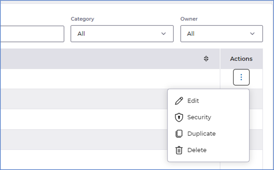
We have improved the layout when editing cloud folders and moved Security to actions.
Why have we done this?
To present the data better so it is inline with other areas of HR.
How will you benefit?
The data is now displayed in line and consistent with the rest of HR.
Details of the change
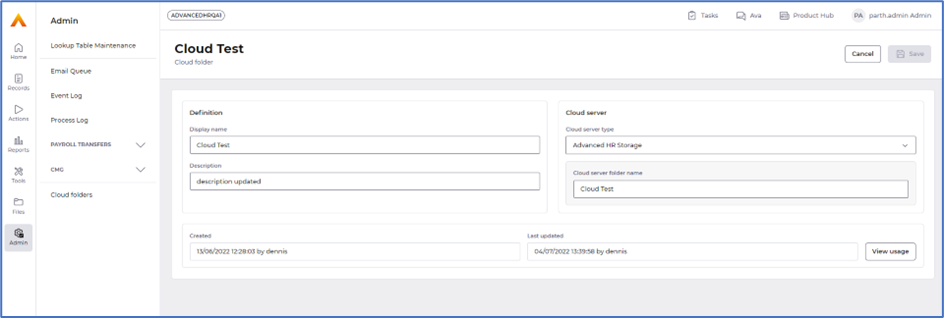
Editing Cloud folders is now presented in sections - Definition, Cloud Server and Usage:
Security can now be accessed via the Actions menu:
Small improvements to Files
What have we done?
We have improved the layout of Files.
Why have we done this?
To present the data better so it is inline with other areas of HR.
How will you benefit?
Accessing Files is now in line and consistent with the rest of HR.
Details of the change
The page header has been renamed to Files and Cloud Folder is now displayed as a dropdown listing Advanced HR and External storage options, also introduced a Search option to allow you to quickly search for the file you want:

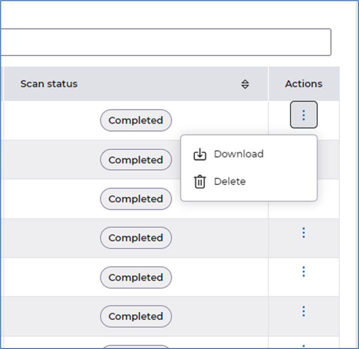
Actions menu has also been introduced providing the following options - Download and Delete:
Changes to the name of Utilities
What have we done?
Changed the naming of Utilities and Page headers to be Plural and sentence case.
Why have we done this?
Previously the name of the utilities were a mix of plural and singular and didn't align with the page header titles.
How will you benefit?
The utility names on the left hand menu now align with the page headers.
Details of the change
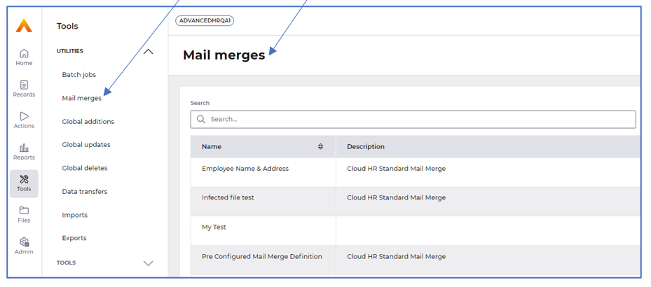
We have made changes to the name of all Utilities so they are now Plural and sentence case and aligns with the name of the page headers, as in the example below for Mail merges:
