Contents
Advanced HR 24.7 - 28th September 2023
Updated
by Kellie Oxley
24.7 Release notes
This page contains details of new and amended functionality included in the software update deployed on the Thursday 28th September 2023.
- Edit action has been removed within records
What have we done?
We have removed the additional Edit click when entering into a record.
Why have we done this?
Following feedback we have removed the additional Edit click when entering into a record and implemented an option to discard any unnecessary changes.
How will you benefit?
You will no longer need to select Edit to make amendments to a record. Accessing a record will automatically present in edit mode, providing you have the appropriate permissions to edit.
Details of the change
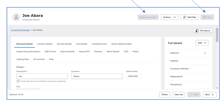
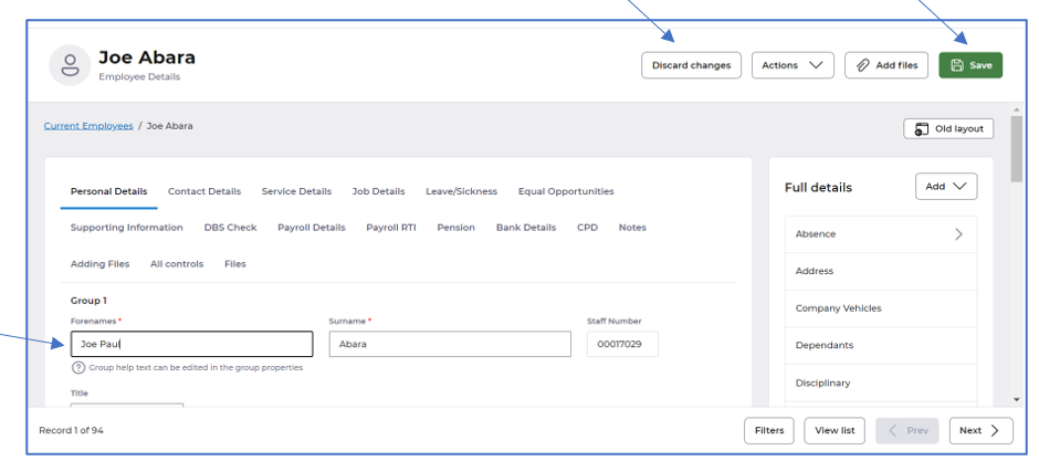
When accessing a record, you will no longer need to select Edit. You can make any changes straight away. We have introduced a Discard changes button to allow you to discard any changes made in error.
When you enter into a record the Discard changes and Save will be greyed out, and become available when you start making a change:
When a change is made to a field Discard changes and Save will become available, as in the example below within the Forenames field:
- The Security tab is now hidden when creating any tool, utility or report
What have we done?
We have removed the Security tab when creating any new tool, utility or report.
Why have we done this?
Given Security is now an option available on the actions menu there was no need to provide the Security tab on creation.
How will you benefit?
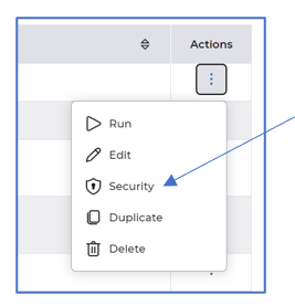
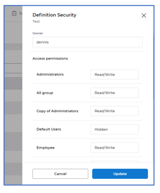
The Security tab is no longer visible when creating a new tool, utility or report. Security is now an option via the actions menu once the tool, utility or report is created.
Details of the change
Once the utility, tool or report is created, the security can be amended via the Actions menu, selecting Security:
- View details has been removed from the actions menu on all tools, utilities and reports
What have we done?
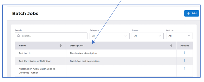
We have removed the View details option within the Actions menu on all tools, utilities and reports and added a Description column on the landing page.
Why have we done this?
This detail was already available within the definition of each tool, utility and report.
How will you benefit?
You will no longer need to select View details as all the detail is within the definitions.
Details of the change
A Description column has been added to each landing page within tools, utilities and reports:
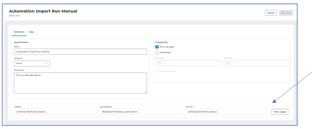
Editing any tool, utility or report will display the usage as follows, you can click View usage for further usage details:
- The filter options have been moved and Create has been renamed to Add, in all tools, utilities and reports
What have we done?
We have removed the Filter button and added the available filters against the search bar within each landing page across all tools, utilities and reports. We have also renamed the Create button to be Add on the landing pages.
Why have we done this?
To ensure filtering is easier to use. We have also renamed the create button to be add so that it is consistent with the rest of HR.
How will you benefit?
You can see which filter is applied much easier and the button wording is consistent with the rest of the HR application.
Details of the change
Filtering is now available as dropdown options beside the search bar and the button to create a new tool, utility or report is now called Add, some examples below:


- Small improvements have been applied to Batch jobs
What have we done?
We have made some small changes to the layout of batch jobs.
Why have we done this?
To present the data within the definition and jobs tab in an easier to read format.
How will you benefit?
Batch jobs are presented in a much easier to read format. Fields moved into sections on the screen with headers for each section of data.
Details of the change
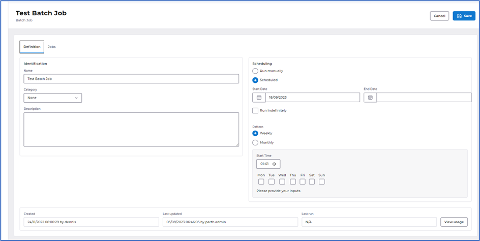
The Definition tab is now displayed in sections - Identification, Scheduling and Usage:
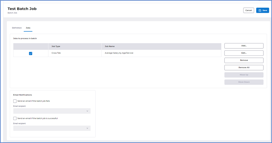
The Jobs tab is now displayed in sections - Jobs to process in batch and Email notifications:
- Small improvements have been applied to Global add, Update, Delete and Data transfer
What have we done?
We have made some small changes to the layout of global adds, updates, deletes and Data transfer.
Why have we done this?
To present the data better within the definition and column tabs and improve how these are run.
How will you benefit?
Global add, update, deletes and Data transfer screens are presented in a much easier to read format. Fields moved into sections on the screen with headers for each section of data. Running any of these utilities is presented in a draw from the right of the screen in line with our standard layout across other areas of HR.
Details of the change
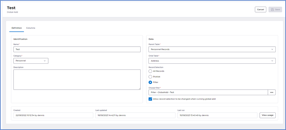
The Definition tab is now displayed in sections - Identification, Data and Usage, with the introduction of the tick box to Allow record selection to be changed when running across all global adds, updates and deletions:
The Columns tab has an improved layout, with the buttons to Add and Remove all displayed at the top:

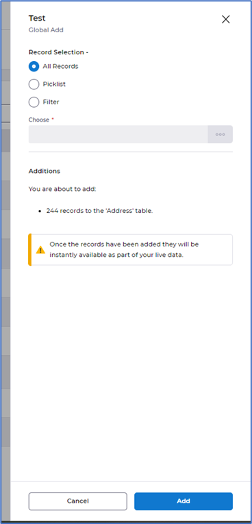
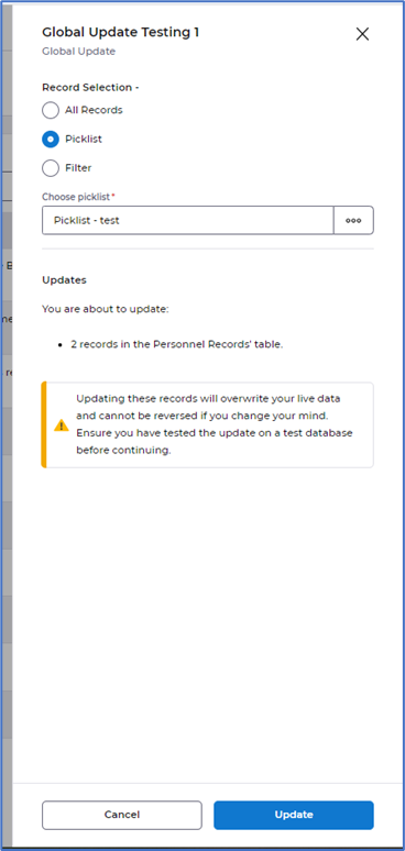
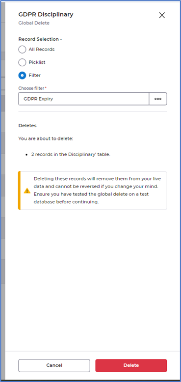
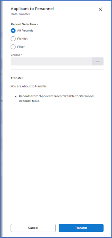
Selecting to Run a Global add, update, delete or Data transfer from the actions menu, will now present as a draw from the right of your screen. Providing you have the tick box, as mentioned above, selected in the definition you are able to amend the record selection. It will also provide you with a summary of the Additions, Updates, Deletes and Transfers before choosing to proceed.
Global Add running:
Global Update running:
Global Delete running:
Data Transfer running:
- Small improvements have been applied to Imports
What have we done?
We have made some small improvements to Imports.
Why have we done this?
To present the data better within the definition and options tabs and improve how these are run.
How will you benefit?
Importing definition and options screens are presented in a much easier to read format. Fields moved into sections on the screen with headers for each section of data. Running imports is presented in a draw from the right of the screen in line with our standard layout across other areas of HR.
Details of the change
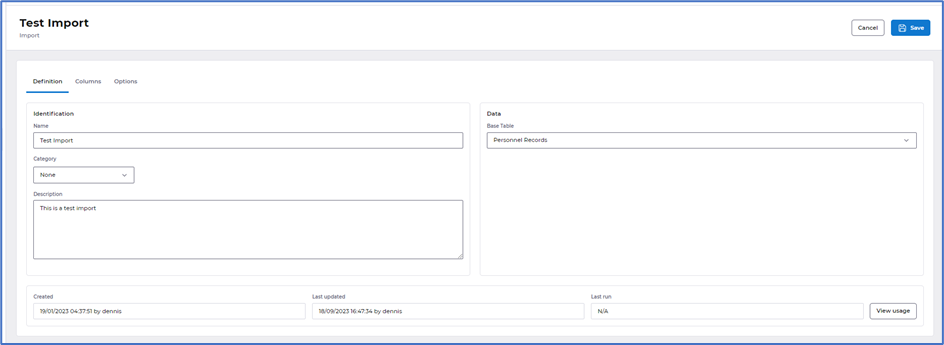
The Definition tab is now displayed in sections - Identification, Data and Usage:
The Options tab is now displayed in sections - Import Format, Source and Records:

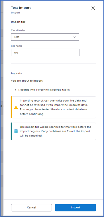
Selecting to Run an Import from the actions menu will now present as a draw from the right of your screen. This provides you with the ability to change the Import file location and file name, and also provides you with a summary of the imports before choosing to proceed.
- Small improvements have been applied to Exports
What have we done?
We have made some small improvements to Exports.
Why have we done this?
To amend how the data is displayed and improve how these are run.
How will you benefit?
Exporting definition, sort order and output are presented in a much easier to read format. Fields moved into sections on the screen with headers for each section of data. Running exports is presented in a draw from the right of the screen in line with our standard layout across other areas of HR.
Details of the change
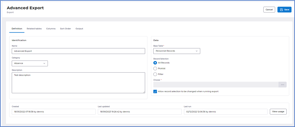
The Definition tab is now displayed in sections - Identification, Data and Usage. We have also introduced a tick box Allow record selection to be changed when running export, which when selected allows the record selection to be changed when running an export:
The Related tables tab now has the same tick box Allow record selection to be changed when running export, which when selected allows the record selection to be changed when running an export:

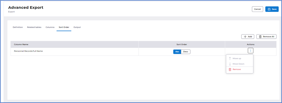
The Sort order tab has had a small improvement with the layout of the buttons and actions:
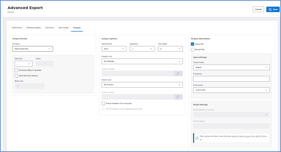
The Options tab has been removed. The details previously displayed in options have been moved to the Output tab. This is broken down into sections - Output format, Output options and Output destination:
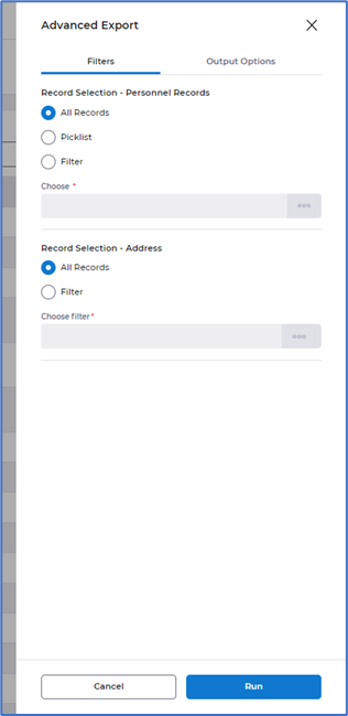
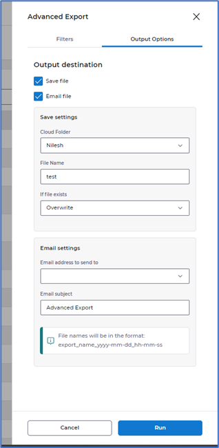
Selecting to Run an Export from the actions menu will now present as a draw from the right of your screen. This is displayed in two tabs, allowing you to amend the record selection filters - providing the tick box is selected in the definition and related tabs as mentioned above and change the output destination:
- Improved layout within Calculations, Filters, Picklists, Email Groups, Email addresses and Document types
What have we done?
We have made some small improvements to all areas within tools.
Why have we done this?
To present the data better inline with other areas within HR.
How will you benefit?
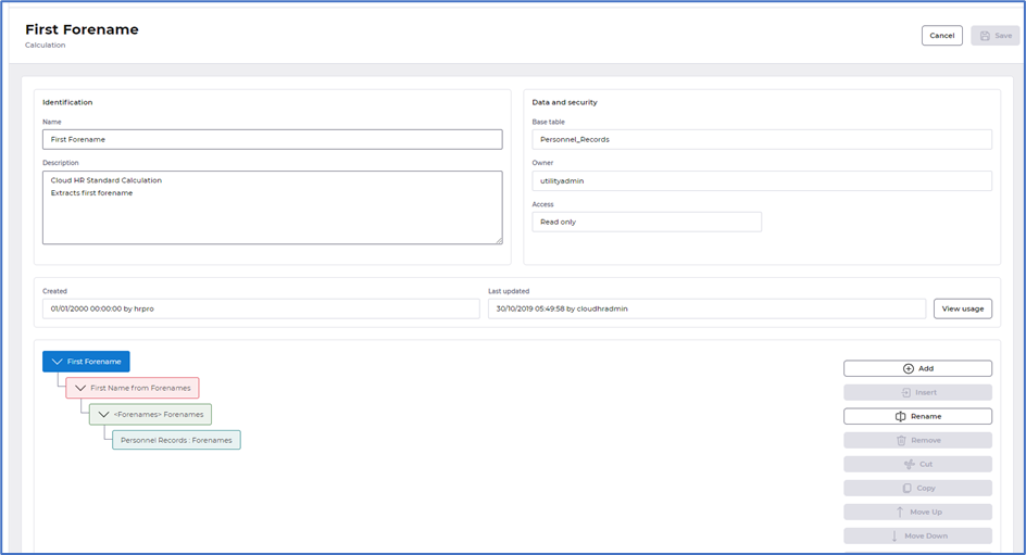
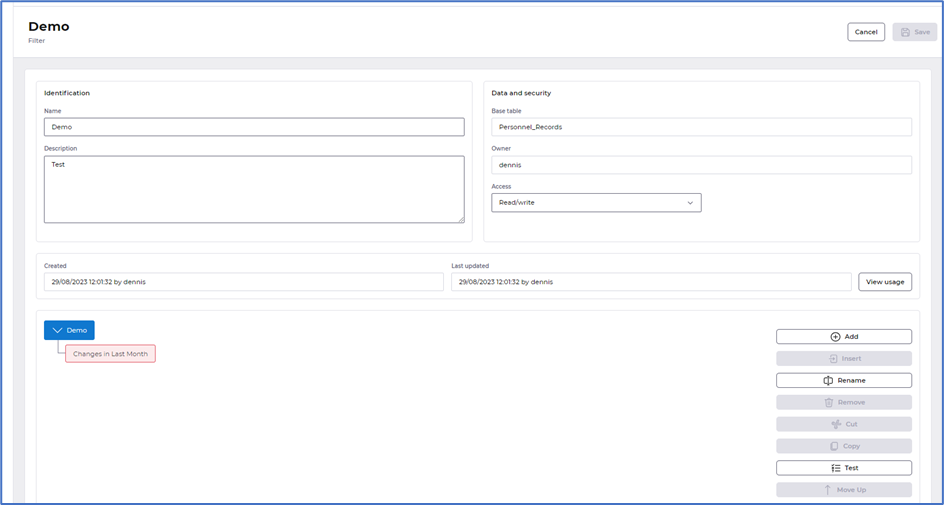
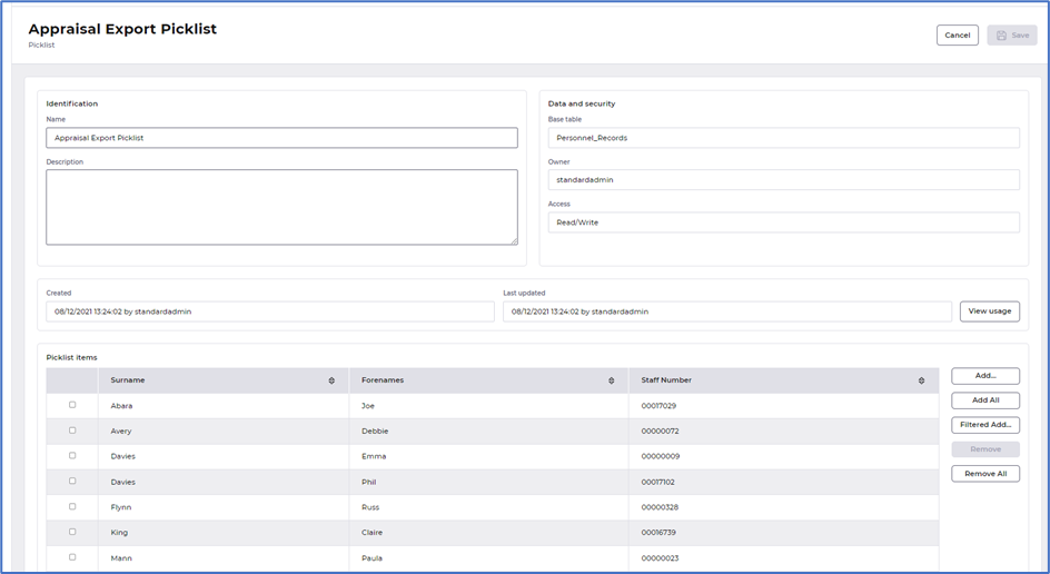
Data within all areas of tools are now presented in a much easier to read format. Fields moved into sections on the screen with headers for each section of data.
Details of the change
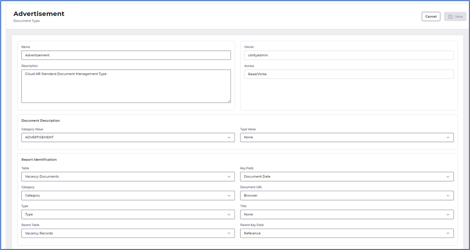
We have added fields into sections across all areas within tools: -
Calculations:
Filters:
Picklists:
Email groups:

Email addresses:

Document types:
- Improved layout within the definition on Custom reports
What have we done?
We have made some small improvements to the definition tab within Custom reports.
Why have we done this?
To present the data better within the definition so it is inline with other areas of HR.
How will you benefit?
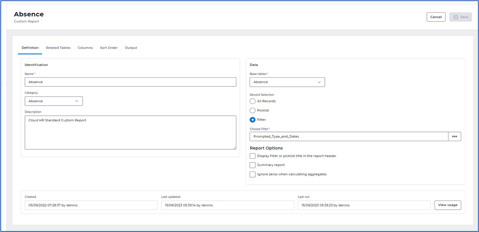
Definition contents within custom reports is presented in a much easier to read format. Fields moved into sections on the screen with headers for each section of data.
Details of the change
The Definition tab is now displayed in sections - Identification, Data and Usage:
