HR team
Administrators
Personas
The HR manager persona
The HR advisor persona
The manager persona
The administrator persona
The employee persona
Uploading files and photos
Files uploaded via workflow
Files uploaded via mail merge
Files uploaded via cloud folders
Files uploaded via an import
Uploading a photo as part of a record
Files uploaded via a batch job
Uploading a file as part of a record
APIs
Knowledge base
Advanced HR Home page
Home navigation
Records navigation
Employee details pages
Actions navigation
Reports navigation
Tools navigation
Files navigation
Admin navigation
New Error/Info pages
Holiday Year End
Support is Evolving
Configuring HR
Policies
Fixed layout
Why are my guidance labels missing?
How to convert a fixed label to a calculated label
How to amend the positioning of a label in an action
Page designer
Processes
Process listing
Process overview: New starter
Process overview: Annual leave cancellation
Process overview: Update my diversity details
Process overview: Subject access request
Process overview: Absence cancellation
Process overview: Shared parental leave request
Process overview: Flexible working request
Process overview: Transfer Adoption to Absence
Process overview: Change of address
Process overview: Transfer Paternity (Birth) to Absence
Process overview: Shared parental leave notification
Process overview: Change of contact details
Process overview: Transfer Paternity (Adoption) to Absence
Process overview: Record leaver
Process overview: Statutory parental bereavement leave notification
Process overview: KIT days request
Process overview: Manage course delegates
Process overview: Annual leave request
Process overview: Absence request
Process overview: Transfer Maternity to Absence
Process overview: Leave authorisation
Process overview: End of year rollover
Process overview: Leaver
Process overview: Sickness continuation
Process overview: Record new starter
Process overview: Record sickness
Process overview: 360 Appraisal feedback
Process overview: Cancel a course
Process overview: Change of bank details
Process overview: Appraisal
Process overview: Training need request
Process overview: SPLIT days request
Process overview: Statutory parental bereavement leave
Access to System and Security Manager
Employees
Release notes
HR 25.1 - 23rd May 2024
Advanced HR 24.10 - 29th February 2024
Advanced HR 24.9 - 18th January 2024
Advanced HR 24.8 - 2nd November 2023
Advanced HR 24.7 - 28th September 2023
Advanced HR 24.6 - 29th August 2023
Advanced HR 24.5 - Thursday 27th July
Advanced HR 24.4 - 22nd June 2023
Advanced HR 24.3 - 18th May 2023
Advanced HR 24.2 - 13th April 2023
Advanced HR 24.1.1 - 23rd March 2023
Advanced HR 24.1 - 9th March 2023
Advanced HR 23.5 - 9th February 2023
Advanced HR 23.4 - 17th January 2023
Advanced HR 23.3 - 15th December 2022
Advanced HR 23.2 - 27th October 2022
Retiring AVA
Advanced HR 24.1 Hotfix - 11th October 2024
Sections

Sections ↕
Sections bridge the gap between vertical layouts and maximising the available space on the page. They split the page into cards that can be read individually in a vertical layout. The cards are then automatically arranged horizontally in rows to make the best use of any remaining space on the page.
We believe this gives the best balance between having an accessible page for infrequent users and making it easy for frequent users to quickly access data.
When setting up sections we'd suggest the following:
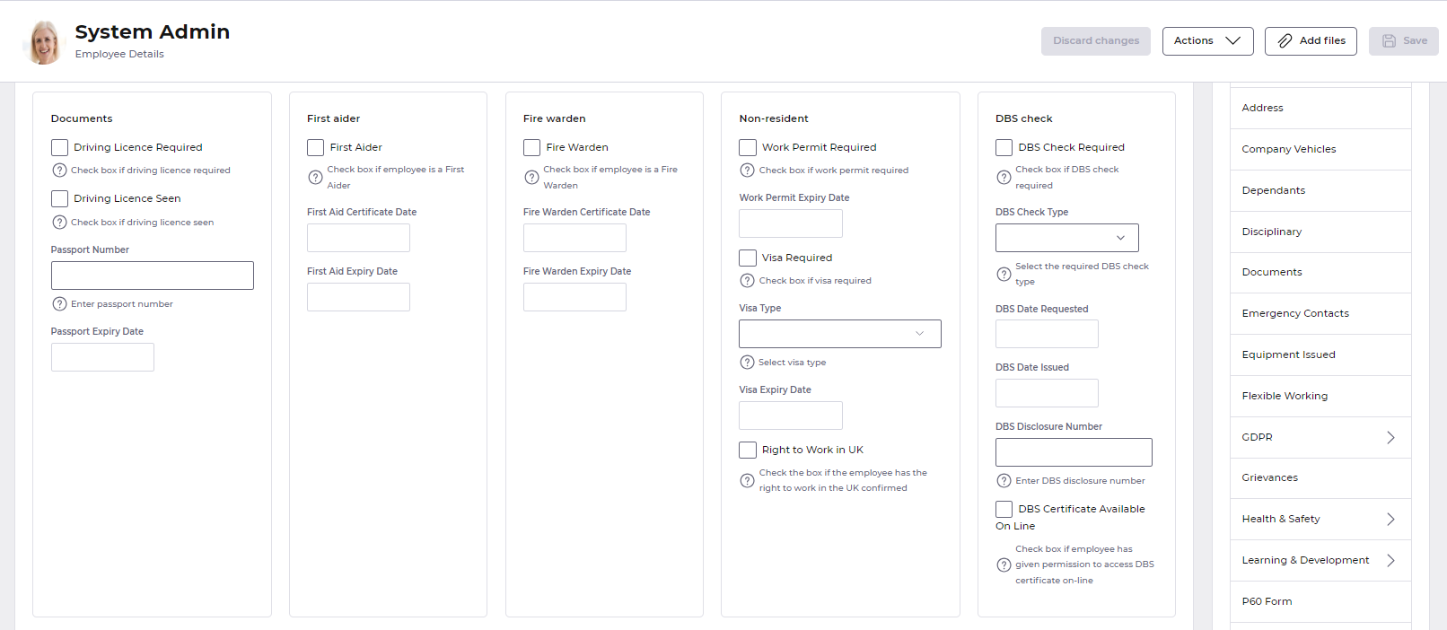
- Keep sections succinct
👪 Sections work best when they contain a family of related fields, such as a section to pull together all the fields related to someone's address. This image shows a good use of sections to pull together related families of fields.
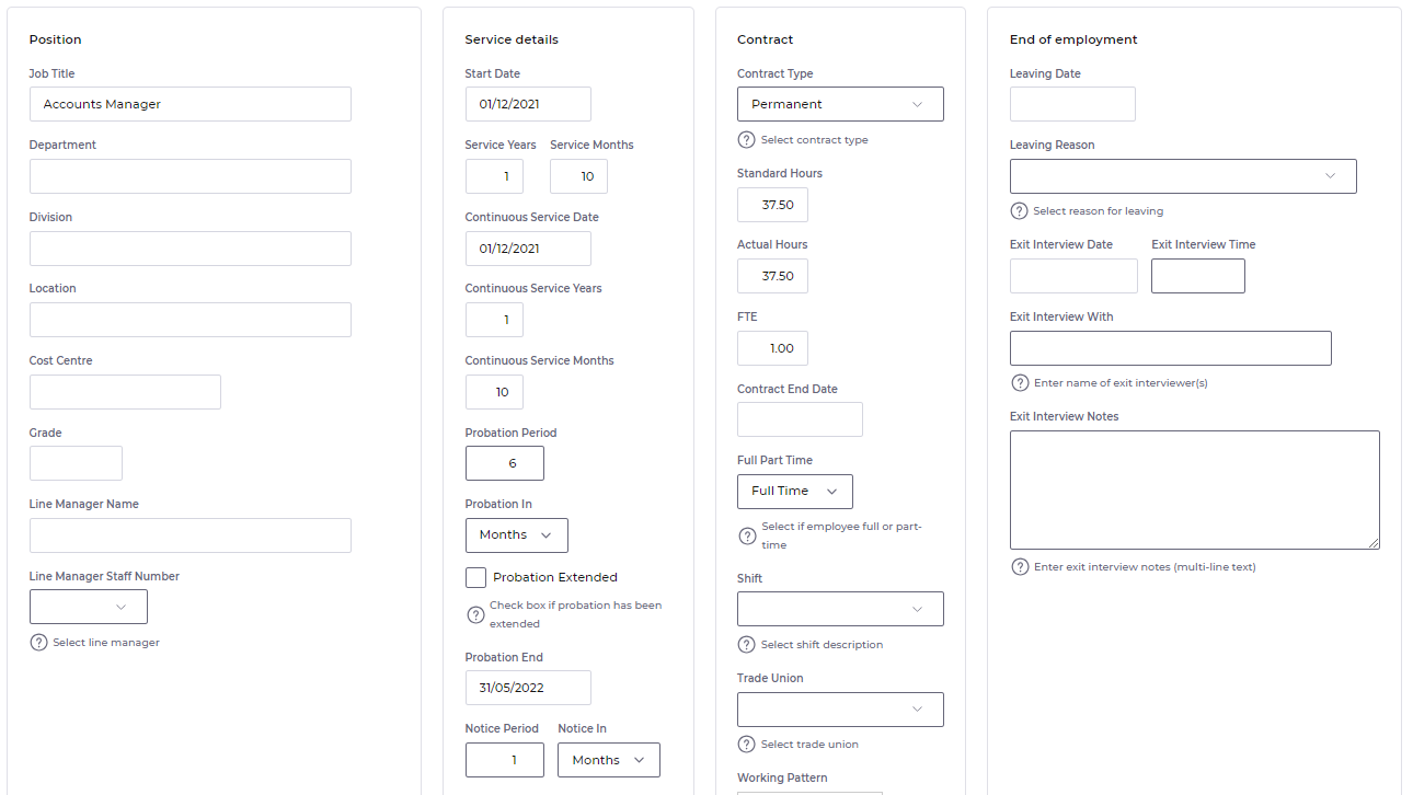
- Keep sections roughly equal sizes
📏 Sections on the same tab work best together when they have roughly the same number of elements. Because sections are arranged in rows, having one section significantly larger than another can introduce space back onto the page. Below is an example of how this can happen with unevenly populated sections.
- Let sections do the horizontal arranging
⛔ Sections work best when they do not contain large horizontal groups. They were designed to answer the question of how to fill up empty space horizontally along the page. If a group is trying to achieve the same goal, then the two features effectively work against each other. In these cases you may find this causes the elements in a group to wrap onto a new row inside the section (as seen in the Wrapping animation).
In certain situations the best use of sections may actually be to not use groups at all...