HR team
Administrators
Personas
The HR manager persona
The HR advisor persona
The manager persona
The administrator persona
The employee persona
Uploading files and photos
Files uploaded via workflow
Files uploaded via mail merge
Files uploaded via cloud folders
Files uploaded via an import
Uploading a photo as part of a record
Files uploaded via a batch job
Uploading a file as part of a record
APIs
Knowledge base
Advanced HR Home page
Home navigation
Records navigation
Employee details pages
Actions navigation
Reports navigation
Tools navigation
Files navigation
Admin navigation
New Error/Info pages
Holiday Year End
Support is Evolving
Configuring HR
Policies
Fixed layout
Why are my guidance labels missing?
How to convert a fixed label to a calculated label
How to amend the positioning of a label in an action
Page designer
Processes
Process overview: New starter
Process overview: Annual leave cancellation
Process overview: Update my diversity details
Process overview: Subject access request
Process overview: Absence cancellation
Process overview: Shared parental leave request
Process overview: Flexible working request
Process overview: Transfer Adoption to Absence
Process overview: Change of address
Process overview: Transfer Paternity (Birth) to Absence
Process overview: Shared parental leave notification
Process overview: Change of contact details
Process overview: Transfer Paternity (Adoption) to Absence
Process overview: Record leaver
Process overview: Statutory parental bereavement leave notification
Process overview: KIT days request
Process listing
Process overview: Manage course delegates
Process overview: Annual leave request
Process overview: Absence request
Process overview: Transfer Maternity to Absence
Process overview: Leave authorisation
Process overview: End of year rollover
Process overview: Leaver
Process overview: Sickness continuation
Process overview: Record new starter
Process overview: Record sickness
Process overview: 360 Appraisal feedback
Process overview: Cancel a course
Process overview: Change of bank details
Process overview: Appraisal
Process overview: Training need request
Process overview: SPLIT days request
Process overview: Statutory parental bereavement leave
Access to System and Security Manager
Employees
Release notes
HR 25.1 - 23rd May 2024
Advanced HR 24.10 - 29th February 2024
Advanced HR 24.9 - 18th January 2024
Advanced HR 24.8 - 2nd November 2023
Advanced HR 24.7 - 28th September 2023
Advanced HR 24.6 - 29th August 2023
Advanced HR 24.5 - Thursday 27th July
Advanced HR 24.4 - 22nd June 2023
Advanced HR 24.3 - 18th May 2023
Advanced HR 24.2 - 13th April 2023
Advanced HR 24.1.1 - 23rd March 2023
Advanced HR 24.1 - 9th March 2023
Advanced HR 23.5 - 9th February 2023
Advanced HR 23.4 - 17th January 2023
Advanced HR 23.3 - 15th December 2022
Advanced HR 23.2 - 27th October 2022
Retiring AVA
Advanced HR 24.1 Hotfix - 11th October 2024
Contents
- All categories
- Administrators
- Configuring HR
- Page designer
- The theory of good design
- Design for intuition
Design for intuition

Design for intuition 💡
The following sections display the same address data in the same order.
Which do you think your users would find easier to read?
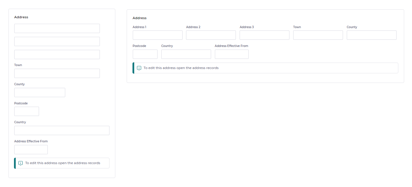
You probably said the one on the left. Because people expect certain bits of data to be displayed in a certain format. Those formats are often internationally recognised and something most people are so familiar with, that they can intuitively use that format with no extra training. An address block is a good example of this.
All to often as administrators, we can get so caught up in the technical aspects of the tools that we're using and the features we're trying build; that we lose track of who we're building things for.