HR team
Administrators
Personas
The HR manager persona
The HR advisor persona
The manager persona
The administrator persona
The employee persona
Uploading files and photos
Files uploaded via workflow
Files uploaded via mail merge
Files uploaded via cloud folders
Files uploaded via an import
Uploading a photo as part of a record
Files uploaded via a batch job
Uploading a file as part of a record
APIs
Knowledge base
Advanced HR Home page
Home navigation
Records navigation
Employee details pages
Actions navigation
Reports navigation
Tools navigation
Files navigation
Admin navigation
New Error/Info pages
Holiday Year End
Support is Evolving
Configuring HR
Policies
Fixed layout
Why are my guidance labels missing?
How to convert a fixed label to a calculated label
How to amend the positioning of a label in an action
Page designer
Processes
Process listing
Process overview: New starter
Process overview: Annual leave cancellation
Process overview: Update my diversity details
Process overview: Subject access request
Process overview: Absence cancellation
Process overview: Shared parental leave request
Process overview: Flexible working request
Process overview: Transfer Adoption to Absence
Process overview: Change of address
Process overview: Transfer Paternity (Birth) to Absence
Process overview: Shared parental leave notification
Process overview: Change of contact details
Process overview: Transfer Paternity (Adoption) to Absence
Process overview: Record leaver
Process overview: Statutory parental bereavement leave notification
Process overview: KIT days request
Process overview: Manage course delegates
Process overview: Annual leave request
Process overview: Absence request
Process overview: Transfer Maternity to Absence
Process overview: Leave authorisation
Process overview: End of year rollover
Process overview: Leaver
Process overview: Sickness continuation
Process overview: Record new starter
Process overview: Record sickness
Process overview: 360 Appraisal feedback
Process overview: Cancel a course
Process overview: Change of bank details
Process overview: Appraisal
Process overview: Training need request
Process overview: SPLIT days request
Process overview: Statutory parental bereavement leave
Access to System and Security Manager
Employees
Release notes
HR 25.1 - 23rd May 2024
Advanced HR 24.10 - 29th February 2024
Advanced HR 24.9 - 18th January 2024
Advanced HR 24.8 - 2nd November 2023
Advanced HR 24.7 - 28th September 2023
Advanced HR 24.6 - 29th August 2023
Advanced HR 24.5 - Thursday 27th July
Advanced HR 24.4 - 22nd June 2023
Advanced HR 24.3 - 18th May 2023
Advanced HR 24.2 - 13th April 2023
Advanced HR 24.1.1 - 23rd March 2023
Advanced HR 24.1 - 9th March 2023
Advanced HR 23.5 - 9th February 2023
Advanced HR 23.4 - 17th January 2023
Advanced HR 23.3 - 15th December 2022
Advanced HR 23.2 - 27th October 2022
Retiring AVA
Advanced HR 24.1 Hotfix - 11th October 2024
- All categories
- Administrators
- Configuring HR
- Page designer
- Feature guides
- Custom elements
Custom elements

Custom elements
Users can now add new fixed elements to a page using the Add element menu found at the bottom of the Page designer screen:
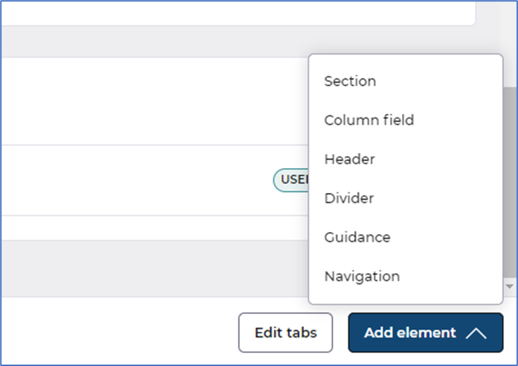
- Section - Users can structure their pages by adding sections.
Here's a quick video explaining how, or jump below for our written guide.
Add elements to a Section by using the ellipsis button (the 3 vertical dots) displayed in the section, or by using the existing move functionality to move a field or group from another section: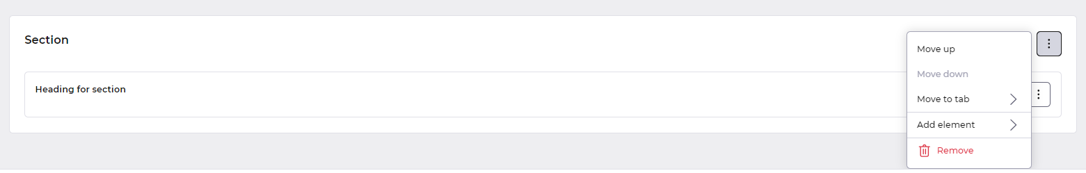
- Move up - Allows you to move the Section Up on the page
- Move down - Allows you to move the Section down on the page - This is greyed out when its at the bottom of the page already
- Move to Tab - This allows you to move a section, with its contents to be displayed on another tab.
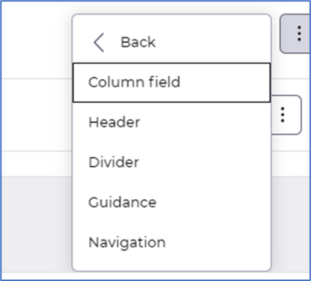
- Add element - Lets you choose a new element to add to the section:
- Remove - This option lets you remove the section, however when removing a section this will also remove all fields and groups from the page and would need to be manually added via the Add element option again.
- Column field - Users can search for, and add, column fields to the current page from the database. The Show all button lists all available column fields:
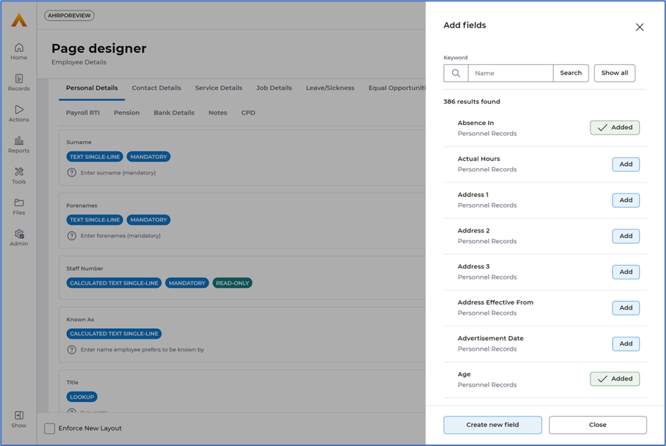
- Any column fields already on the selected page tab are shown with an Added indicator.
- Header - Users can add header elements to the page:
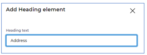
- These are prominent labels that can be placed anywhere with user definable text. For example, we could remove the field labels from the address fields, and display a generic Address heading instead:
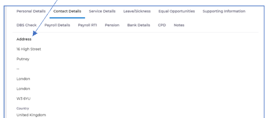
- These are prominent labels that can be placed anywhere with user definable text. For example, we could remove the field labels from the address fields, and display a generic Address heading instead:
- Divider - Inserts a full width horizontal line into the page, which can be re-positioned:
- Guidance - Guidance panels are prominent panels of text which can be used to provide guidance to users on the page. When creating the guidance panel, the text is specified:
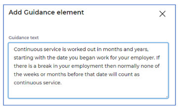
- Guidance panels are displayed to users as follows:
- Guidance panels are displayed to users as follows:
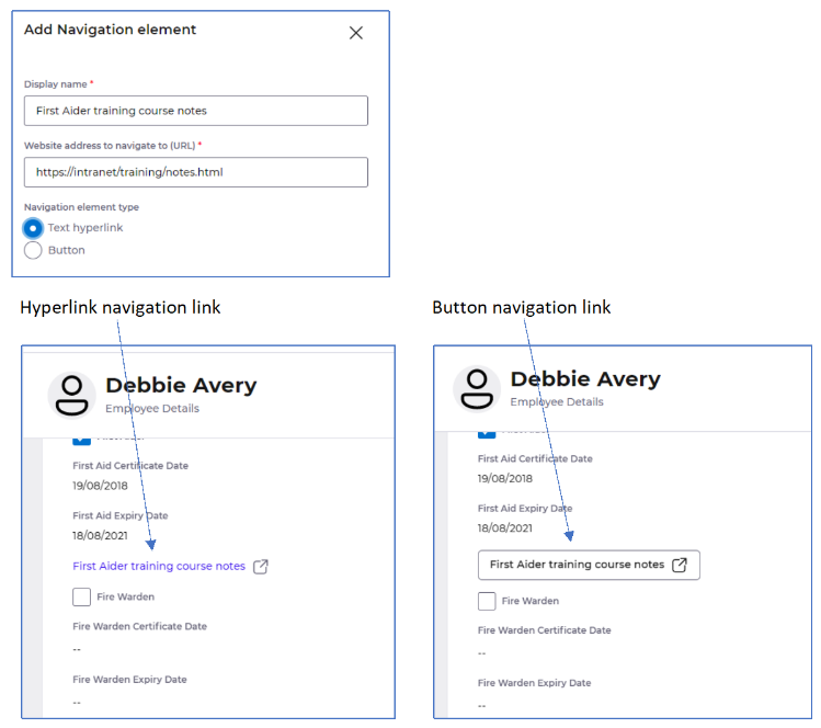
- Navigation - Users can provide links to website addresses using navigation links. These links can be displayed as a hyperlink or a button. The link will open the website in a new tab, or window depending on the user’s browser configuration and device: